 Français
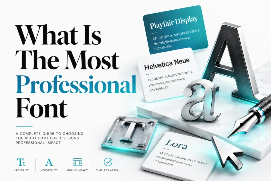
What is the most professional font? The honest answer depends on your document, audience, and platform, because professional typography is measured by clarity, trust, consistency, and purpose. A font that looks excellent in a resume may feel too formal on a creative website, while a display font that works in a logo can become unreadable in a report.
In most business settings, Helvetica, Arial, Calibri, Georgia, Garamond, Open Sans, Lato, Roboto, and Montserrat are strong choices because they are readable, balanced, familiar, and easy to use across professional materials. Read for more!
What Makes A Font Look Professional?
A professional font looks clear before it looks clever, because readers judge your message through spacing, shape, weight, and readability before they think about design style. When you want to test a headline, social bio, or visual concept quickly, a tool that helps you create stylish fonts in seconds can generator and show you how different letter styles change the feeling of your words without forcing you to redesign everything. The safest choice for serious work is still a clean typeface with consistent strokes, open letterforms, strong spacing, and enough contrast to make every word easy to scan.
Professional fonts also respect context, which means a font that looks excellent on a law firm website may look too stiff for a creator portfolio. You should look at the reader’s goal, the device they use, and the emotional signal you want to send before choosing a typeface. If your font makes a proposal, resume, presentation, or landing page feel easier to trust, it is already doing professional work.
What Is The Most Professional Font For Everyday Use?
For everyday business use, Helvetica is often treated as one of the most professional fonts because it is neutral, polished, and widely recognized. Arial is the practical backup because it appears on almost every system, loads reliably, and keeps documents readable when you share files with people using different software.
Calibri also remains a strong workplace option because it feels modern, simple, and calm in email, office documents, spreadsheets, and internal reports.
Best Professional Fonts For Business Documents
Business documents need fonts that help readers absorb information quickly, especially when they are reviewing proposals, reports, contracts, invoices, or training material. If you design business content in Canva or similar tools, canva font combination generation can help you think about font pairing as a structured design choice rather than a random visual decision. Pairing a strong heading font with a calm body font makes your document easier to navigate, and that structure can improve how professional your content feels.
For body text, safe choices include Arial, Calibri, Georgia, Garamond, Open Sans, and Lato because they remain readable across print and screen. For headings, Montserrat, Helvetica, Playfair Display, and Merriweather can create more authority without overwhelming the page. Keep your font system simple by using one family for body copy, one for headings, and weight changes for hierarchy.
Best Professional Fonts For Websites And Digital Products
Websites need fonts that load quickly, scale cleanly, and stay readable on phones, tablets, laptops, and large monitors. Decorative styles can be useful for themed projects, and a smoke font generator shows how smoky lettering creates dramatic display text, but that kind of effect should stay in logos, banners, or creative graphics rather than long website paragraphs. A professional website font must support navigation, scanning, accessibility, and brand recognition before it supports decoration.
For digital products, Roboto, Open Sans, Inter, Lato, Source Sans, and Public Sans are strong choices because they have open shapes and practical spacing. For editorial websites, Georgia, Lora, Merriweather, and Source Serif can add warmth while still supporting long-form reading. Your best website font should feel invisible during reading and memorable only through the overall brand experience.
Serif Vs Sans Serif: Which Looks More Professional?
Serif fonts have small finishing strokes at the ends of letters, and they often communicate tradition, authority, elegance, and editorial confidence. Garamond, Georgia, Baskerville, Lora, Merriweather, and Times New Roman can work well for books, legal pages, formal invitations, academic documents, luxury brands, and long-form articles. They are especially useful when you want your writing to feel established, thoughtful, or classic.
Sans serif fonts remove those finishing strokes, which gives them a cleaner, more modern, and more digital-friendly appearance. Helvetica, Arial, Roboto, Open Sans, Lato, Montserrat, Futura, and Public Sans can work well for websites, software, presentations, dashboards, pitch decks, and business reports. Neither category is automatically better, so choose serif when you need authority and choose sans serif when you need clarity, speed, and modern simplicity.
How Font Size, Spacing, And Hierarchy Affect Professionalism
A good font can still look unprofessional when the size is too small, the lines are too tight, or the page has no clear hierarchy. Body text needs comfortable line spacing, enough margin space, and a readable size that does not force readers to zoom, squint, or reread the same line. Headings should guide the eye naturally, so your reader can understand the page structure before reading every sentence.
Hierarchy matters because professional communication is rarely consumed from top to bottom in one slow pass. People scan headings, captions, buttons, bold phrases, and section breaks before deciding where to focus. You can make almost any clean font look more professional by using consistent heading sizes, clear paragraph spacing, balanced white space, and restrained emphasis.
Best Font Choices For Resumes And Cover Letters
Resume fonts should look polished, applicant-tracking-system friendly, and easy for hiring managers to scan quickly. Arial, Calibri, Garamond, Georgia, Helvetica, Cambria, and Times New Roman are practical options because they are familiar, readable, and unlikely to distract from your qualifications. If you work in design, marketing, or media, a modern font like Lato, Montserrat, or Open Sans can feel fresher while still staying professional.
Best Font Choices For Presentations And Reports
Presentation fonts must stay readable from a distance, which means thin strokes, cramped spacing, and overly decorative letterforms usually create problems. Helvetica, Arial, Calibri, Aptos, Lato, Roboto, Open Sans, and Montserrat work well because they keep slides clean and visible. For presentation titles, you can use a stronger heading font, but the supporting text should stay simple enough to read at a glance.
Reports need a slightly different approach because readers spend more time with dense paragraphs, charts, tables, and explanations. Georgia, Merriweather, Source Serif, Garamond, Open Sans, and Lato can make longer documents feel organized without becoming cold or mechanical. Your report font should support trust, especially when the document includes data, recommendations, financial information, or executive decisions.
Fonts To Avoid In Professional Work
Some fonts weaken professional credibility because they look playful, dated, crowded, or difficult to read. Comic Sans, Papyrus, Curlz, overly ornate scripts, extreme novelty fonts, and distressed display fonts can distract readers from your message. Even when a font is popular online, it may not belong in a resume, proposal, corporate website, legal document, or client presentation.
How To Pair Professional Fonts Correctly
Font pairing works best when the two fonts have contrast but still share a similar level of polish. A common method is to use a strong sans serif font for headings and a readable serif font for body copy, such as Montserrat with Merriweather or Helvetica with Georgia. You can also use one font family in multiple weights, which often creates the cleanest result for corporate websites and reports.
Simple Pairing Rule
Choose one font for attention and one font for reading, then let size, weight, and spacing create the rest of the hierarchy. This prevents the design from feeling crowded while still giving your page enough structure to guide the reader. If two fonts fight for attention, remove the louder one and keep the typeface that makes the message easier to understand.
How To Choose A Font For Your Brand Voice
Your brand voice should guide your font choice because typography sends emotional signals before people read the full message. A financial advisor may need stable, conservative typography, while a creative agency may need something more expressive, modern, and memorable. If the font’s personality conflicts with your offer, readers may feel subtle doubt even when the words are clear.
Think of your font as part of your brand’s behavior, not just its appearance. Rounded fonts can feel friendly, geometric fonts can feel modern, classic serifs can feel trustworthy, and high-contrast display fonts can feel luxurious. The right professional font makes your brand feel intentional without making the design feel forced.
Accessibility And Readability Should Come First
Professional typography should include people with different screens, lighting conditions, reading speeds, and visual needs. Choose fonts with open counters, clear character differences, and strong spacing so letters like I, l, 1, O, and 0 do not confuse readers. Good contrast between text and background also matters because even a beautiful font fails when people cannot read it comfortably.
Accessibility is not only a technical concern; it also improves business results by making content easier for more people to use. A font that works for mobile visitors, older readers, busy professionals, and fast scanners will usually perform better than a trendy font with weak readability. When in doubt, test your font at small sizes, on different devices, and in the longest paragraph you plan to publish.
A Simple Checklist Before You Choose A Professional Font
Before choosing a font, ask whether it matches the audience, purpose, platform, and emotional tone of your project. Check whether the font is readable in headings, paragraphs, buttons, tables, captions, resumes, and mobile screens.
Then confirm that the license allows your intended use, especially when the font appears in commercial branding, client work, digital products, or advertising.
Conclusion
What is the most professional font? For most people, the strongest answer is Helvetica for polished neutrality, Arial for dependable compatibility, Calibri for everyday office use, Georgia or Garamond for classic authority, and Open Sans or Roboto for modern digital readability. The smartest choice is not the trendiest font, but the one that makes your content easier to trust, scan, understand, and remember.
When you match the font to your purpose, keep the design consistent, use readable spacing, and avoid distracting styles, your typography will look professional across resumes, websites, reports, presentations, and brand materials.