 Français
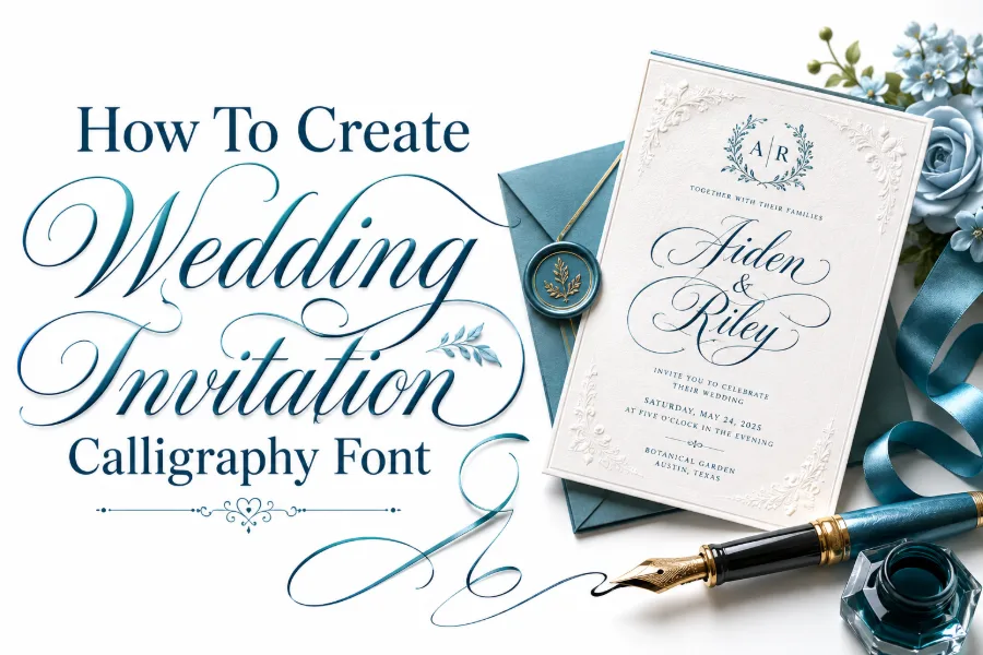
How to create wedding invitation calligraphy font begins with one clear goal: making letters feel romantic, readable, and personal at the same time. A wedding font should not only look beautiful on a screen; it should guide the eye through names, dates, venues, and reception details without confusion.
When you understand style, spacing, hierarchy, tools, and final testing, you can build a calligraphy look that feels elegant enough for invitations and practical enough for envelopes, menus, save-the-dates, and digital wedding graphics. Keep reading for more details.
Start With The Mood Of The Wedding
The first step is to define the feeling the wedding should carry, because calligraphy must match the event before it can impress guests. A black-tie ballroom wedding may call for refined Copperplate-style curves, while a garden wedding may feel better with a soft, modern script and open spacing. A font tool can help you create stylish fonts in seconds, but your design will look stronger when you choose the mood before choosing the letters.
Think of the invitation as the first scene of the wedding rather than a piece of decoration. If the couple wants luxury, use taller capitals, graceful entry strokes, and balanced flourishes; if they want warmth, use relaxed strokes, rounded letterforms, and gentler contrast. Your calligraphy font should tell guests what kind of celebration they are entering before they read every detail.
Match Style To Setting
A beach wedding can use airy spacing and casual script, while a cathedral wedding may need a more formal style. Rustic weddings often work well with hand-drawn imperfections, but luxury weddings usually need cleaner strokes and stronger alignment. The more clearly the font reflects the setting, the more intentional the invitation feels.
Choose A Script Style That Fits Real Wedding Use
How to create wedding invitation calligraphy font successfully depends on choosing a script style that looks beautiful without creating reading problems. Copperplate, Spencerian-inspired lettering, and modern pointed-pen calligraphy are common choices because they bring romance, movement, and contrast to names and headings. Italic calligraphy can also work well for minimalist invitations because it looks elegant without heavy flourishes.
Avoid choosing a style only because it looks dramatic in a sample word. Wedding invitations include names, dates, locations, long venue addresses, RSVP notes, and sometimes multiple family lines, so the font must remain readable in both short and long text. A script that looks stunning for “Olivia” may become messy when used for “Saturday, the twenty-third of September at half past four in the afternoon.”
Your safest approach is to create two levels of calligraphy. Use the most decorative version for the couple’s names, then use a calmer companion style for details. This keeps the invitation elegant while protecting clarity.
Build Letterforms Before Adding Flourishes
Strong calligraphy starts with the basic shape of every letter, not the swirls around it. Before you add loops, tails, and ornamental strokes, sketch lowercase letters, uppercase letters, numbers, punctuation marks, and common wedding words like “together,” “reception,” “honor,” “celebration,” and “ceremony.” Dramatic lettering can also teach contrast because a black letter font generator focuses on bold, formal letter shapes, and that same discipline helps you understand why heavy strokes, spacing, and structure matter in wedding calligraphy.
Make sure every letter has a consistent slant, x-height, entry stroke, and exit stroke. If one lowercase “h” leans forward while the other stands upright, the font will feel accidental rather than handmade. Consistency is what makes a calligraphy font look professional, even when the style is soft and expressive.
Focus On The Alphabet System
Create a full alphabet sheet before designing invitation words. This helps you compare letters side by side and notice weak forms early. When the alphabet functions as a system, the final invitation looks unified rather than patched together.
Plan Font Pairings For Invitation Hierarchy
Wedding invitations need visual hierarchy so guests can quickly find the couple’s names, date, time, venue, and RSVP information. Your calligraphy font should usually lead the design, while a simple serif, sans serif, or clean small-cap style supports the details. If every line uses the same decorative script, the invitation may look fancy but become difficult to scan.
Pairing is not about adding random fonts; it is about giving each section a job. The calligraphy font can handle names and emotional phrases, while the supporting font can carry addresses, times, and instructions with quiet confidence. Designers who work with digital layouts often study Canva font combination generation because thoughtful pairings help decorative and simple fonts work together without competing.
A useful rule is to limit the invitation to two main type styles. One expressive calligraphy style and one readable companion font are usually enough. More than that can make the design feel crowded, especially on smaller cards.
Design The Couple’s Names As The Main Feature
The couple’s names are usually the emotional center of a wedding invitation, so your calligraphy font should make them feel memorable. Start by writing the names larger than the surrounding text, then adjust stroke width, spacing, and flourishes until the names feel balanced. The goal is not to decorate every letter equally; it is to guide attention naturally to the names without overwhelming the rest of the invitation.
When two names have different lengths, balance becomes important. A short name like “Ava” may need gentle spacing or a wider flourish, while a longer name like “Christopher” may need tighter letter spacing and fewer extensions. You should test both names together instead of designing each one separately.
Control The Flourishes
Flourishes should frame the names, not fight them. Add longer strokes to the first or last letter only when the surrounding space can handle them. If a flourish touches another word or crosses a date, remove it or simplify it.
Make Spacing And Kerning Part Of The Design
Spacing can make or break a wedding calligraphy font because script letters connect in ways that standard typed fonts do not. If the space between letters is too tight, loops collide and details disappear; if it is too wide, the word loses its graceful flow. Kerning matters most around difficult pairs such as “Th,” “We,” “ov,” “ly,” and letters with long entry or exit strokes.
You should test spacing inside real invitation phrases instead of judging single letters alone. Words like “together,” “wedding,” “ceremony,” “honor,” and “forever” reveal whether your letter connections feel natural. A beautiful alphabet can still fail if the letters do not sit well beside one another.
Good spacing also improves print quality. Thin strokes need breathing room, especially on textured paper, handmade paper, or cotton cardstock. When spacing is planned correctly, the calligraphy feels graceful, and the details stay legible after printing.
Create A Readable Invitation Layout
A wedding invitation is not only a font sample; it is a communication piece that must deliver information clearly. Start the layout by placing the couple’s names, then build the date, time, venue, and reception information around them. This gives the design a natural center and prevents the details from looking scattered.
Use generous margins because calligraphy needs space to breathe. Tight edges can make even elegant lettering look cramped, especially when swashes extend beyond the main text area. If you plan to print on standard invitation sizes, test your layout at actual size before finalizing the font.
Use Visual Zones
Separate the invitation into clear zones such as opening line, names, event details, and closing note. Each zone should have its own spacing and weight. This makes the invitation easier to read while still allowing the calligraphy to feel artistic.
Test The Font On Wedding Words And Names
A calligraphy font may look polished in a short preview, but wedding stationery requires many different names and phrases. Test the font on long names, hyphenated names, venue names, family names, and formal wording. This helps you catch weak letters before the final invitation is printed or shared.
Pay attention to capital letters because wedding invitations often use names, places, and formal lines that begin with uppercase forms. The uppercase letters should feel special but not so decorative that they slow down reading. If an uppercase “G,” “S,” or “B” looks confusing, simplify it before using it in the final design.
Numbers also matter because dates and times appear on almost every wedding invitation. Make sure numbers match the style of the letters. If your numerals look too plain beside the calligraphy, the invitation may feel unfinished.
Decide Between Handwritten, Digital, Or Hybrid Calligraphy
You can create wedding invitation calligraphy with a pointed pen, brush pen, tablet, vector software, or a mix of tools. Handwritten calligraphy gives the design warmth and variation, while digital calligraphy makes editing, resizing, and reusing the font much easier. A hybrid method often works best because you can write by hand, scan the best letters, clean them digitally, and build a reusable style.
If you are creating a full font, digital cleanup is important. Remove shaky edges, fix uneven stroke endings, and standardize baseline behavior while keeping enough handmade charm. The font should not look robotic, but it should behave predictably when typed.
Choose your method based on the final use. A one-time custom invitation may work beautifully as handwritten artwork, while a font for templates, client projects, or repeated stationery needs consistent digital files. The right method saves time and protects quality.
Pick Paper, Ink, And Print Conditions Early
Paper affects calligraphy more than many beginners expect. Smooth paper helps pointed pens glide, while textured paper adds character but can cause ink feathering, broken strokes, or uneven edges. If the invitation will be printed, test the font on the same cardstock, color, and finish planned for the final set.
Ink color also changes the feeling of the font. Black feels formal, brown feels vintage, navy feels refined, gold feels luxurious, and soft gray feels delicate. Your letterforms should remain readable in the chosen color, especially when the design uses thin hairlines or small details.
Printing can reduce the sharpness of fine strokes, so avoid making hairlines too fragile. What looks crisp on a bright screen may disappear on matte paper. Always print a sample before approving the final calligraphy style.
Add Decoration Without Hurting Clarity
Wedding calligraphy often uses swashes, floral touches, curved baselines, and ornamental initials, but decoration should support the invitation instead of distracting from it. Use flourishes around open spaces such as the top margin, bottom corner, or around the couple’s names. Avoid sending decorative strokes through dates, addresses, or RSVP details.
A good flourish follows the rhythm of the word. It should feel like a natural extension of the letter, not an extra shape pasted onto the design. If you remove a flourish and the word becomes easier to read, the flourish was probably too much.
Keep The Guest In Mind
Guests should not have to guess the venue name or ceremony time. Decorative calligraphy is successful when it feels emotional and clear at once. Beauty matters, but readability protects the purpose of the invitation.
Prepare The Font For Digital Wedding Assets
Modern wedding calligraphy often appears beyond printed invitations. Couples may use the same style on wedding websites, social media announcements, welcome signs, seating charts, menus, thank-you cards, and digital RSVP graphics. Your calligraphy font should therefore work at different sizes and in different formats.
Test the font on mobile screens because many guests first see wedding details on a phone. Fine strokes that look elegant on a large desktop preview may become too light on a small screen. Increase contrast or simplify details when the font needs to appear in digital graphics.
Also prepare variations if possible. A regular version can handle names, a simpler version can handle smaller text, and alternate letters can add personality without forcing the same flourish every time. These options make the font more flexible for full wedding branding.
Avoid Common Wedding Calligraphy Mistakes
The biggest mistake is confusing decoration with elegance. Too many loops, too many font styles, and too many ornaments can make the invitation feel busy instead of luxurious. Elegant calligraphy usually depends on restraint, rhythm, and clean hierarchy.
Another mistake is designing only for the couple’s names and ignoring the rest of the invitation. A wedding font must handle dates, locations, numbers, punctuation, and formal wording. If those details look weak, the design will not feel complete.
You should also avoid waiting until the final layout to test the font. Test early, print early, and revise before the deadline gets close. Wedding stationery often involves envelopes, inserts, menus, and signs, so small font problems can multiply quickly if you catch them late.
Final Checklist Before You Use The Font
Before using the font on a real wedding invitation, review it like a designer and a guest. Check whether the names stand out, the date is easy to understand, the venue is readable, and the style matches the wedding mood. If one area feels unclear, fix the layout before changing the whole font.
Use this checklist before approval:
- The couple’s names look balanced and elegant.
- The date, time, and venue are easy to read.
- The flourishes do not collide with other text.
- The supporting font does not compete with the calligraphy.
- The printed sample looks as good as the screen version.
- The font works on matching stationery pieces.
A careful final review protects the design from small mistakes. It also helps the invitation feel polished, personal, and ready for guests.
Conclusion
How to create wedding invitation calligraphy font comes down to blending beauty with function, because a wedding invitation must feel emotional while still giving guests clear information. Start with the wedding mood, build consistent letterforms, plan hierarchy, test names and real wording, then refine spacing, flourishes, paper, and print quality before final use.
A strong calligraphy font should make the couple’s names feel special, but it should also support dates, venues, RSVP details, and matching stationery without losing readability. When you design with intention instead of decoration alone, your wedding calligraphy becomes more than pretty lettering. It becomes a complete visual voice for the celebration, helping every invitation feel personal, polished, and memorable from the first glance.