 Français
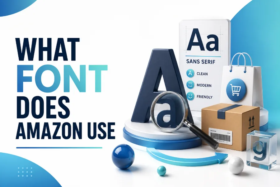
What font does Amazon use is a common question because Amazon’s typography looks simple, friendly, and highly functional at the same time. The short answer is that Amazon uses Amazon Ember as its main brand and interface typeface, while its logo has a more customized history shaped by brand updates, display lettering, and the famous smile arrow.
This guide explains the font used across Amazon’s website, app, Kindle products, Prime branding, and newer identity, so you can apply the same design lessons without copying a proprietary font. Read on!
What Font Does Amazon Use Today?
Amazon mainly uses Amazon Ember, a custom sans-serif typeface designed for clarity across product pages, apps, devices, ads, and brand interfaces. When you need a fast way to test display styles for your own non-Amazon projects, a browser-based tool that helps you create stylish fonts immediately can be useful for exploring visual tone before you choose a final font system. Amazon’s clean look comes from disciplined typography, not decorative effects or random font choices.
Amazon Ember feels modern because it avoids unnecessary detail while still keeping enough warmth to feel human. You see this balance in the softer curves, open shapes, readable spacing, and practical weights that work on small screens and large layouts. That is why Amazon can use it across shopping pages, account menus, Prime content, and device interfaces without visual confusion.
Amazon Ember Explained
Amazon Ember is a proprietary humanist sans-serif typeface created for Amazon’s brand ecosystem. It supports digital reading, quick scanning, and a consistent experience across pages where people compare prices, read product names, check delivery details, and move through checkout. Unlike a generic system font, Amazon Ember gives the company a recognizable voice while keeping the interface practical and familiar.
The font family includes different styles for different jobs, including lighter text styles, bolder emphasis styles, and display-focused versions used in stronger brand moments. The Amazon Ember Display is often discussed for its softer, rounded feel, which suits logos, headings, and promotional uses. This shows a mature brand approach: one type family can support many touchpoints when each weight and style has a clear purpose.
Why Amazon Ember Looks So Friendly And Useful
Amazon Ember works because it prioritizes readability over personality. A shopping interface must help people compare details quickly, so a font with open counters, clear letter shapes, and balanced spacing reduces visual friction. Designers often test how letter pairings feel together, and Canva font combination generation describes a page focused on combining fonts for Canva-style designs, where contrast, hierarchy, and visual balance matter.
The friendly look also supports Amazon’s broader brand promise. The company wants the interface to feel easy, quick, and dependable, so the font cannot look too formal, too playful, or too experimental. Amazon Ember sits in the middle: confident enough to be trusted, simple enough for utility, and warm enough for everyday use.
Is The Amazon Logo Font The Same?
The Amazon logo is not simply typed out in a font you can download and use freely. Some sources connect the logo’s earlier structure to ITC Officina Sans Bold, while other discussions focus on Amazon Ember Display and later custom refinements that make the wordmark feel unique. When you compare logo lettering with dramatic display styles, black letter font generator represents a different direction because black letter text is historic, dense, and expressive, while Amazon’s wordmark stays simple and commercial.
The smile arrow is also part of the typography story because it changes how you read the mark. It points from “a” to “z,” suggesting variety, completion, and satisfaction without adding extra words. That makes the logo more than a font choice, because the custom wordmark and arrow work together as a compact brand message.
Amazon Ember Modern And The Newer Brand Direction
Amazon’s typography has not stayed frozen, and newer brand discussions point to Amazon Ember Modern as part of a refined visual direction. This newer style appears narrower, more compact, and slightly more energetic than the original Ember, with letterforms that feel more human and less mechanical. Because public details are limited, describe Amazon Ember Modern carefully rather than claiming it has replaced every Amazon type style.
What matters for readers is the direction of the change. Amazon seems to be sharpening its brand system without abandoning the principles that made Ember effective: legibility, friendliness, and scalability. For your own branding, that is the lesson to take to heart: careful refinement often works better than a confusing redesign.
Amazon Ember Vs Bookerly Vs Officina Sans
Amazon Ember is the main interface and brand typeface, but it is not the only typeface associated with Amazon. Bookerly is Amazon’s custom serif font built for Kindle reading, where longer-form text needs rhythm, comfort, and a book-like feel on digital screens. Officina Sans is often mentioned in relation to the older logo foundation, but the current Amazon wordmark should be treated as custom lettering rather than a normal typed font.
These distinctions help you avoid a common mistake. If you ask what font Amazon uses, ask where it is being used: the website, app, logo, Kindle books, Prime branding, or product interface. A large brand can use multiple typefaces, but each one should serve a different reading environment and brand function.
Key Design Traits That Make Amazon Ember Work
Amazon Ember succeeds because its design supports speed. The letterforms are open enough for quick recognition, the shapes are neutral enough for broad audiences, and the weights are flexible enough for buttons, product titles, captions, prices, and headings. You do not notice the font loudly, and that is part of its success.
Letterforms That Support Speed
A strong retail font must help people decide without slowing them down. Amazon Ember uses a practical structure that keeps letters distinct, so product names and interface labels remain clear even when pages contain many competing details. This matters on mobile, where shoppers may see ratings, delivery dates, sponsored labels, prices, discounts, and buttons in a small area.
Can You Download Or Use The Amazon Font?
You should treat Amazon Ember as a proprietary brand font, not as a free font for public commercial use. Some files may appear online, but finding a file does not mean you have the legal right to use it in a logo, website, product, or client project. If you are creating your own brand, the safer path is to choose a licensed alternative with a similar clean, humanist, sans-serif feel.
This matters for U.S. businesses, agencies, and creators who need brand assets they can use confidently. A font choice should support the design, but it should also protect the project from licensing problems. You can still learn from Amazon’s typography without copying Amazon’s protected brand assets.
Best Legal Alternatives To Amazon Ember
If you want a similar look, start with clean sans-serif families that balance readability and warmth. Inter, Lato, IBM Plex Sans, DM Sans, Nunito, Roboto, Open Sans, and Helvetica Neue can all work depending on your design goals. None is a perfect Amazon Ember clone, but each can help you build a modern interface with good spacing, strong legibility, and polish.
Choosing The Right Alternative
Choose Inter when you want a crisp interface, Lato when you want a warmer voice, and IBM Plex Sans when you want a more structured brand system. Choose Nunito when friendliness matters, Roboto when Android familiarity helps, and Open Sans when you need broad readability with a neutral tone. Your best choice depends on whether the project should feel corporate, playful, editorial, or product-focused.
How To Build An Amazon Inspired Font System
A strong Amazon-inspired font system begins with hierarchy, not imitation. Pick one primary sans-serif family, define sizes for headings and body text, and decide when to use regular, medium, semibold, and bold weights. Then test it on real content, because product names, prices, labels, and buttons reveal weaknesses faster than a polished mockup.
Use these rules to keep the system consistent:
- Use one main font family for most interface text.
- Reserve bold weights for emphasis, not decoration.
- Keep button text short, clear, and action-based.
- Test readability on mobile before approving the style.
Common Mistakes To Avoid
The biggest mistake is assuming the Amazon logo font and Amazon’s interface font are the same thing. The logo is a custom brand asset, while Amazon Ember supports wider digital use across screens, products, and marketing systems. Treating both as identical can lead to weak design advice and poor font recommendations.
Another mistake is copying the surface look without understanding the function. Amazon’s typography works because it supports trust, speed, and decision-making in a busy shopping environment. If your website uses similar fonts but poor spacing, weak contrast, oversized headings, or cluttered cards, you will not get the same polished effect.
What Designers Can Learn From Amazon’s Typography
Amazon teaches you that brand typography should disappear when users need speed and appear when the brand needs recognition. On a product page, the font should help the shopper scan information without thinking about the typeface. In a logo, ad, or Prime placement, the same system can become more recognizable through weight, spacing, color, and layout.
The lesson is not to make every brand look like Amazon. The lesson is to make every font decision serve a job. If a typeface improves readability, supports trust, scales across devices, and stays consistent, it is doing the quiet work strong brands need.
How To Use This Knowledge In Your Own Brand
Use Amazon’s typography as a model for decision-making, not as a file to copy. Begin with your audience, because a law firm, SaaS tool, healthcare brand, gaming site, and online store need different typographic moods. A clean sans-serif may be the right foundation, but the final choice should match your content, your customers, and the level of trust your brand needs to create.
Also think beyond the font name. Spacing, font size, line height, button labels, contrast, and consistent heading rules affect how professional the design feels. Amazon shows that typography becomes powerful when it is part of a complete system, not a single decorative choice.
Conclusion
What font does Amazon use is best answered in layers: Amazon mainly uses Amazon Ember for brand and interface typography, the logo is a customized wordmark, and Kindle reading uses Bookerly for long-form comfort.
You should not copy Amazon’s proprietary font for your own commercial identity, but you can learn from its clean structure, readable shapes, flexible weights, and consistent use across digital experiences. If you want a similar professional feel, choose a legal sans-serif alternative, build a clear hierarchy, test it on real content, and make every type choice support trust, speed, and usability.